Upside Down
51.5464° N, 0.0554° W 2026.02 Edition 001

An Exercise
in Unlearning
North.

There is no “up” in space. Every map you’ve ever seen has been oriented by someone else’s idea of what matters.

North isn’t naturally at the top. It was put there.

The Blue Marble

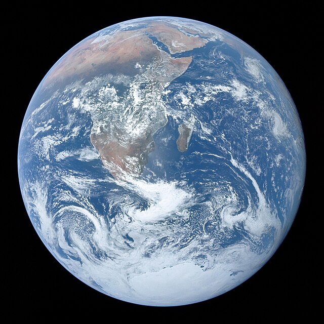
The most famous photograph of Earth was taken upside down.

On 7 December 1972, the crew of Apollo 17 photographed the whole Earth from 29,400 km. In the original frame, Antarctica gleams white at the top. Africa stretches to the right. A cyclone churns in the Indian Ocean. This is what Earth actually looks like from that angle.

NASA rotated the image 180° before releasing it. South-up felt “wrong.” The planet itself had to be corrected to match our maps.

No one has been far enough from Earth to take this photograph since.
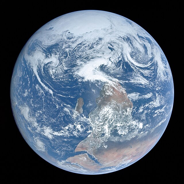
Blue Marble original orientation, south on top Original photograph · AS17-148-22727
Blue Marble NASA version, north on top “Corrected” by NASA
Enter the Map →
Mercator Bearing 180° South-Up z11
“There is no north or south in space. Only closer and further from the sun.” Buckminster Fuller
The History of Orientation

The word ‘orientation’ comes from Latin oriens — ‘east.’

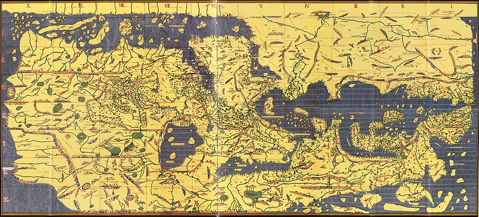
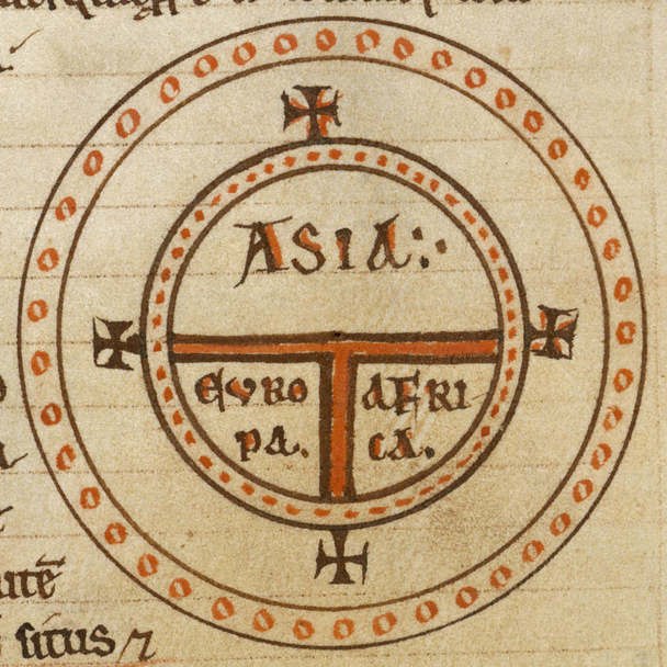
Medieval maps placed east at the top because that’s where Paradise was. Arab cartographers put south at the top because Mecca was to the south. Ancient Egyptians followed the Nile: south was upstream, south was up.

North claimed the top of the map around 500 years ago, when European navigators standardised their compass-centric view and the printing press locked it in place. It was never inevitable. It was a decision — and like all decisions, it carried politics.

Ancient Egypt South ↑ The Nile flows north — upstream was south, so south was up
Islamic Cartography South ↑ Al-Idrisi’s Tabula Rogeriana (1154) placed Mecca toward the top
Ancient China South ↑ Chinese compasses were “south-pointing needles”
Medieval Europe East ↑ T-O maps placed Paradise & the rising sun at top
Post-1500s Europe North ↑ Compass + printing press + colonial expansion
Al-Idrisi's Tabula Rogeriana, 1154 — south is at the top Al-Idrisi · Tabula Rogeriana · 1154 · South-up
T-O Mappa Mundi, 12th century — east is at the top T-O Mappa Mundi · 12th c. · East-up
The Mercator Problem

On a Mercator map, Greenland looks roughly the size of Africa. In reality, Africa is fourteen times larger.

You could fit the United States, China, India, and most of Europe inside Africa — with room to spare. Brazil appears insignificant next to North America; it’s actually larger than the contiguous United States. Alaska looks as large as Brazil — Brazil is nearly five times bigger.

Mercator designed his projection in 1569 for sailors. It was never meant to represent the world. But classrooms, newsrooms, and tech companies adopted it as the default, and for centuries it has inflated the Northern Hemisphere while shrinking the Global South — the same territories that were colonised by the people who made the maps.

Every projection distorts something. But not every distortion has been so convenient for power. As Arno Peters argued — his equal-area projection sold over 80 million copies — “the debate over my map was in reality not a struggle about a projection as such but about a world picture. Clearly, ideology had entered the struggle.”

True Size Comparisons
Africa 30.4M km²
Greenland 2.2M km²
True Ratio Africa is 14× larger
Brazil vs USA Brazil is larger
Alaska vs Brazil Brazil is 5× bigger
Greenland Error 73.9% inflated
“Every projection distorts something. But not every distortion has been so convenient for power.”
Beyond Mercator

Every projection is a compromise. Here’s what the compromise looks like.

No flat map can perfectly represent a sphere. Mercator became the default through empire, not merit. These nine projections show the range of what’s possible when you question the frame.

Mercator

Cylindrical Conformal · 1569

The one everyone knows. The one that lies. Greenland appears the size of Africa. Europe sits at centre. Five centuries of colonial cartography baked into every classroom wall.

Gall-Peters

Equal-Area Cylindrical · 1855

The one that started the culture war. Ugly on purpose. Every stretched, distorted continent is an accusation. UNESCO adopted it. Nebraska made it law.

Equal Earth

Pseudocylindrical · 2018

The modern replacement. Equal-area like Peters but actually beautiful. If you’re making one map for a dissertation or presentation, this is it.

Robinson

Pseudocylindrical · 1963

The compromise projection. Neither equal-area nor conformal, but it looks right. National Geographic adopted it, then abandoned it. The acceptable middle ground.

Mollweide

Pseudocylindrical · 1805

The soft ellipse. Two centuries old, still the best shape for thematic data viz. Its oval frame quietly insists the world isn’t a rectangle.

Dymaxion

Icosahedral · Buckminster Fuller · 1954

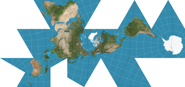
No up, no down, no centre. An icosahedron unfolded. Fuller’s argument: there is no north in space. Jasper Johns painted it. The triangles can be rearranged to tell different stories.

Waterman Butterfly

Polyhedral · Steve Waterman · 1996

The most beautiful projection, full stop. A truncated octahedron unfolded into a butterfly shape. Minimal distortion everywhere. The map as aesthetic provocation.

Goode’s Homolosine

Interrupted · 1923

The globe peeled like an orange. The interruptions are the message: every projection involves cutting, and where you cut reveals what you value.

Azimuthal Equidistant

Azimuthal · c. 1000 CE

The counter-mapping weapon. Centre it on any community and the world radiates outward from their perspective. Used on the UN flag and in Indigenous cartography.

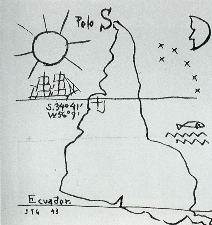
América Invertida by Torres García, 1943

“Nuestro norte es el Sur.”

“Our north is the South. There should be no north for us, except in opposition to our South. That is why we now turn the map upside down.”

Joaquín Torres García · Uruguayan artist and theorist · Universalismo Constructivo · 1935

Torres García was an artist and teacher in Montevideo who argued that Latin America should stop looking to Europe for cultural validation. His ink drawing América Invertida became a rallying cry for an entire continent’s intellectual independence.

Stuart McArthur

At twelve, he drew a south-up map. His teacher gave him a failing grade.

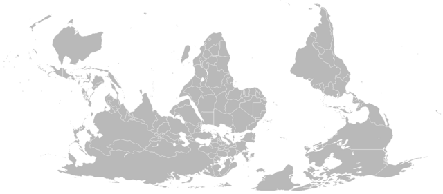
In 1970, a twelve-year-old boy in Melbourne drew a south-up map for a school project. His geography teacher failed it, demanding the “correct” orientation.

At fifteen, on exchange in Japan, American students mocked him for coming from “the bottom of the world.” He vowed to publish a corrective map.

At twenty-one, Stuart McArthur launched McArthur’s Universal Corrective Map of the World on Australia Day, 1979, from the steps of Melbourne University. Australia sat confidently at the top. It has sold over 350,000 copies — the best-selling south-up map in history. Proof that one stubborn Australian can shift a paradigm.

McArthur's Universal Corrective Map of the World
The Corrective Map
Published 1979
Copies Sold 350,000+
Orientation South-Up
Featured In The West Wing
Counter-Cartographies

Artists & architects who flipped the script

Drawing for Projection by William Kentridge

Guy Debord

France · 1957

Cut the map of Paris into fragments and reassembled them based on emotion, not geography. His psychogeographic maps of the dérive dismantled the planner’s claim to objectivity.

The Naked City
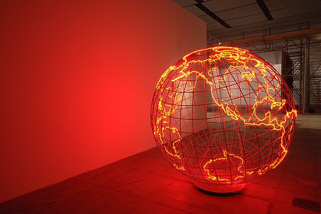
Hot Spot III by Mona Hatoum

Mona Hatoum

Palestine / UK · 2006

A neon globe where every continent is a crisis zone. Maps cast in soap and glass beads that crumble underfoot. Territory as fragile material, geography as violence.

Present Tense & Hot Spot
Dymaxion Map by Buckminster Fuller

Buckminster Fuller

USA · 1943

Unfolded the globe into an icosahedron with no inherent top or bottom. Countries float without hierarchy. The whole map can be rearranged like a net.

Dymaxion Map
Drawing for Projection by William Kentridge

William Kentridge

South Africa · 1989

Animated charcoal drawings where maps of Johannesburg dissolve and redraw themselves. Borders erased and redrawn in real time — apartheid geography as living wound.

Drawings for Projection
World Map by Öyvind Fahlström

Öyvind Fahlström

Sweden / Brazil · 1972

World maps with moveable magnetic pieces. Viewers rearrange countries, rewrite borders, redistribute power. The map was never finished — and that was the point.

World Map
McArthur's Universal Corrective Map

Stuart McArthur

Australia · 1979

Published the Universal Corrective Map from the steps of Melbourne University on Australia Day, 1979. South on top. 350,000 copies sold. Proof one stubborn Australian can shift a paradigm.

Universal Corrective Map
The Psychology

When we say things “went south,” we mean they went wrong.

Research shows that people associate north positions on maps with wealth, prestige, and higher altitude, while south positions are linked to poverty and lower status. Brian Meier at Gettysburg College proved the critical finding: when participants were shown south-up maps, the bias completely disappeared. The preference isn’t cognitive — it’s cultural, learned through the deep metaphorical chain linking north to up to good to powerful. (Meier et al., “A metaphor-enriched social cognition,” Cognition, 2011)

Thomas Saarinen collected 3,568 freehand world maps from students in 52 countries. 79% were Eurocentric — even students in Africa, Asia, and Latin America drew Europe at the centre and Africa diminished. His most devastating observation: students from formerly colonised countries drew maps with the colonial power at centre, illustrating “the idea that the centre lies elsewhere.” (Saarinen, “Centering of Mental Maps of the World,” National Geographic Research, 1987)

“The map is not a picture. It is an argument.” Denis Wood · The Power of Maps · 1992
Voices

Nine ways of saying the same thing: maps are not neutral.

From courtrooms to classrooms, from poetry to code, people across disciplines have challenged the map on the wall. What emerges is a chorus — politicians, philosophers, poets, hackers, and twelve-year-olds, all arriving at the same conclusion: how we orient the world on paper shapes how we inhabit it.

Politicians & Policymakers

“Eighty-six percent of our students are students of color and many have parents from places on the map that are underscale or distorted. It only seems right that we would present them with an accurate view of themselves.”

Hayden Frederick-Clarke · Boston Public Schools · 2017

Boston became the first US district to adopt the Gall-Peters projection. 600 classrooms. 57,000 students. Cost: $12,000.

Urbanists

“The reduction of three-dimensional realities to two dimensions has conferred a redoubtable power — a violence intrinsic to abstraction.”

Henri Lefebvre · The Production of Space · 1974

David Harvey documented the cost: in Mumbai, slum dwellers live “without legal title — the places they live are left blank on all maps of the city.”

Communities

“Our map shows all of the things that don’t have a price. Building it we also build our communities.”

Opi Nenquimo · Waorani leader · Ecuador · 2019

The Waorani used open-source mapping tools to chart their territory and sued the government for drilling without consent. They won.

Educators

“Yeah, but you can’t do that.” — “Why not?” — “Because it’s freaking me out.”

The West Wing · Season 2, Episode 16 · 2001

18 million viewers watched a fictional cartography group flip the map south-up on network television. The scene became a classroom staple.

Philosophers

“Make a map, not a tracing. The map is entirely oriented toward experimentation in contact with the real. It can be torn, reversed, adapted, reworked by an individual, group, or social formation.”

Deleuze & Guattari · A Thousand Plateaus · 1980

Foucault argued “space is fundamental in any exercise of power.” Said coined “imaginative geography.” Mignolo showed how colonial maps erased indigenous spatial knowledge.

Technologists & Hackers

“There’s a blindness that arises from thinking of data as objective, unambiguous and interpretation free.”

Simon Weckert · Google Maps Hacks · 2020

Weckert loaded 99 smartphones into a handcart and walked past Google HQ, turning every street red on Google Maps and diverting real traffic.

Cartographers

“Much of the power of the map is that it operates behind a mask of a seemingly neutral science. It hides and denies its social dimensions at the same time as it legitimates.”

J.B. Harley · Deconstructing the Map · 1989

The most cited essay in critical cartography. Harley’s verdict: “To those who have strength in the world shall be added strength in the map.”

Poets

“I like maps, because they lie. Because they give no access to the vicious truth. Because great-heartedly, good-naturedly they spread before me a world not of this world.”

Wisława Szymborska · Map (final poem) · 2012

The Polish Nobel laureate was working on this poem when she died. Bishop, Borges, Walcott, Glissant — poets have always known maps are fictions.

Children

“The southern hemisphere is so undeveloped because the ideas fall off.”

Mafalda (Quino) · Argentina

When university students across 52 countries drew freehand world maps, 79% produced Eurocentric images — even students in Africa, Asia, and Latin America. Europe was always exaggerated. Africa was always diminished.

Key Data
Peters Projection 80M+ copies sold
Saarinen Study 3,568 maps · 52 countries
Map Kibera ~1M people mapped visible
Missing Maps 105M+ edits · 185K contributors
HOT 94 countries · 170K+ mappers
Meier et al. Reverse the map → bias vanishes
North-Up Convention < 500 years old
The Movement

A growing network of counter-cartographers is redrawing the world.

Across continents, indigenous communities, forensic researchers, activist collectives, and open-source mappers are building alternatives to the colonial cartographic tradition. These projects don’t just flip the map — they question who gets to draw it in the first place.

Native Land Digital

Interactive map of indigenous territories, treaties, and languages. Over 200 nations’ boundaries, drawn by the nations themselves.

native-land.ca

Forensic Architecture

Uses spatial analysis, 3D modelling, and satellite imagery to investigate state violence and human rights abuses.

London / Global

Anti-Eviction Mapping Project

Documents displacement and resistance in San Francisco, New York, and beyond. Maps as tools of tenant solidarity.

San Francisco / NYC

The Decolonial Atlas

Crowd-sourced collection of maps that challenge dominant geographic narratives. South-up, indigenous-centred, and power-aware.

decolonialatlas.wordpress.com

Detroit Geographic Expedition

1960s radical geography project that trained Black Detroiters to map their own neighbourhoods, documenting inequality from the inside.

Detroit, 1968–1971

Iconoclasistas

Argentine collective creating participatory maps and infographics with communities to visualise resistance, territory, and collective memory.

Buenos Aires

kollektiv orangotango

Editors of This Is Not an Atlas, the open-access anthology of counter-cartographies from 40+ countries.

Berlin

Geochicas

Women and non-binary mappers closing the gender gap in OpenStreetMap. Mapping femicides, safe spaces, and invisible labour across Latin America.

Latin America / Global

Map Kibera

Thirteen young Nairobians trained with GPS and OpenStreetMap to map Africa’s largest informal settlement — a complete blank spot on official maps. Making the invisible visible.

Nairobi, 2009

Ushahidi

Crowdsourced crisis-mapping born from Kenya’s 2007 disputed election. Deployed in 160+ countries with over 50 million reports. Testimony as technology.

Kenya / Global
Further Reading

Go deeper.

“In the universe there is no ‘up’ and ‘down’, or ‘north’ and ‘south’: only ‘in’ and ‘out’.” Buckminster Fuller

Look
again.

The next time you open a map on your phone, notice where north is. Notice what’s big and what’s small. Notice what’s at the centre and what’s been pushed to the edge.

Then ask yourself: who decided this was the right way to look at the world?

Launch the Map ⟳ or read the full story →